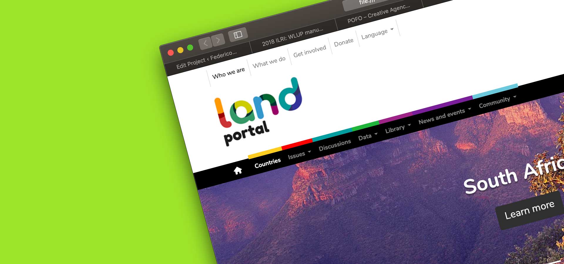
A bold new identity
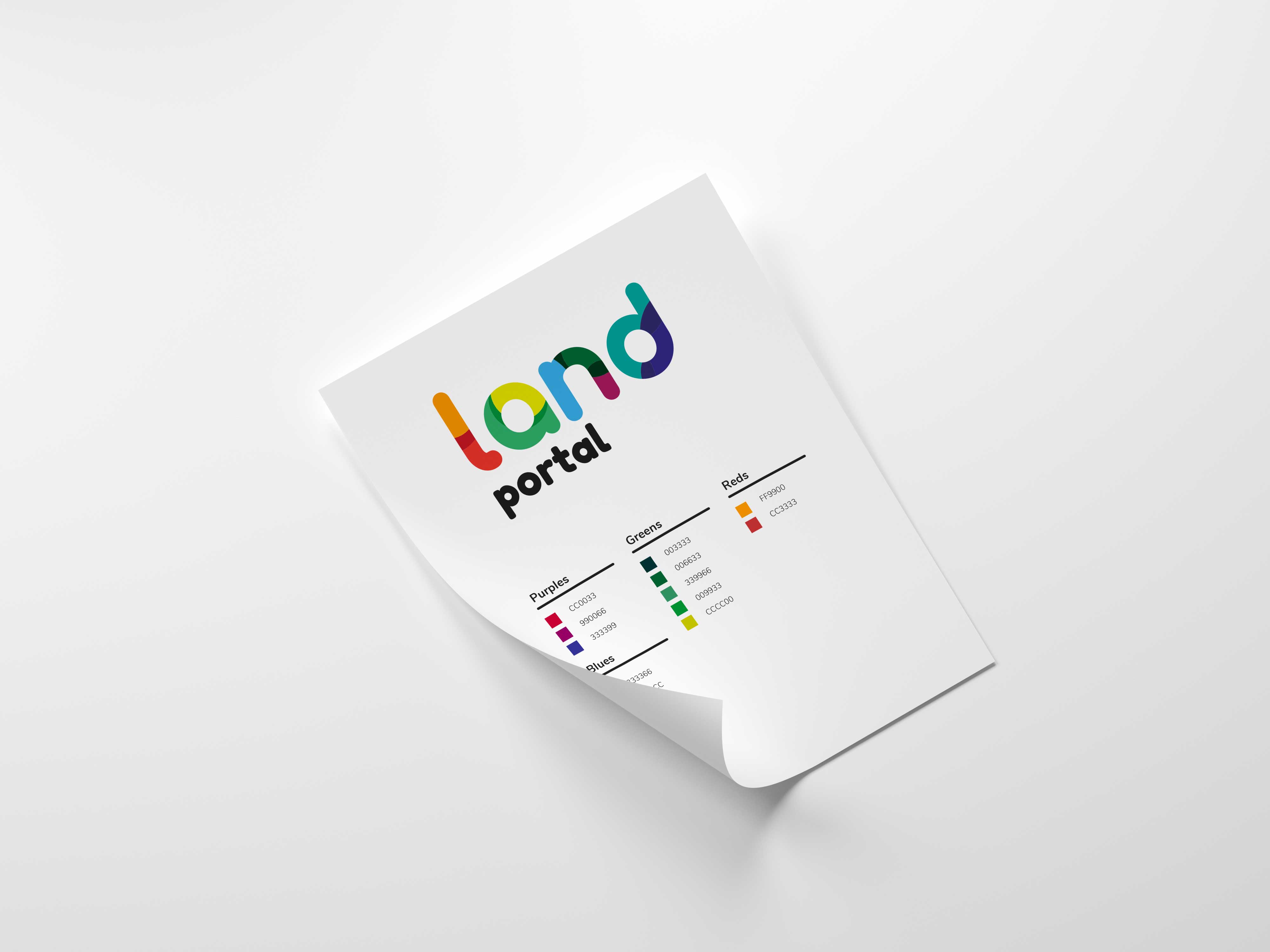
Different multicoloured fragments coming together under the “land” umbrella. Punchy, colourful, mostly aimed at the web and digital distribution.
- Branding Design
- The Land Portal Foundation
- Logo
Coming together.
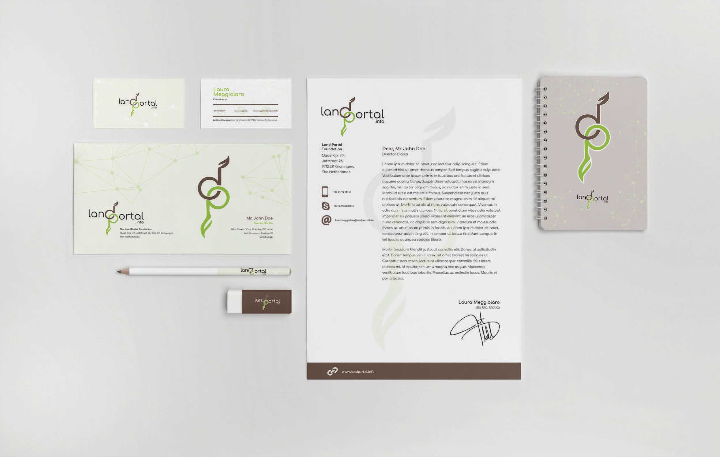
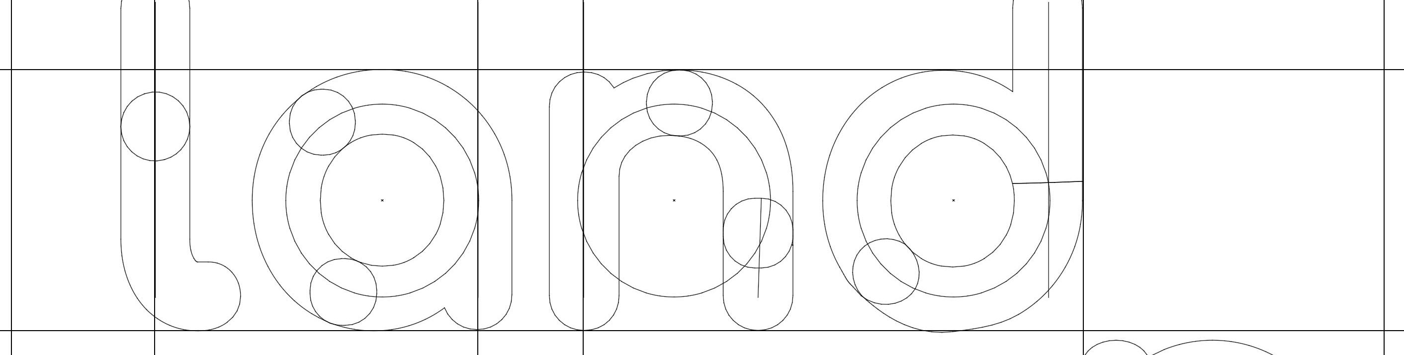
Colours have been chosen and positioned so that the letters stay as readable as possible independently from size and printing conditions. They are subsequently reflected by the Land Portal menus and assets and refer to different tools and data types.
Due to the complexity of its structure, the Land Portal’s website is progressively transitioning towards the updated design. New layouts and assets for many of the pages and tools are being designed at this moment.
- ClientThe Land Portal Foundation
- IndustryInternational organisation
- ServicesBranding specialist
- Websitelandportal.org

A break from the past.
I have been lucky enough to follow Land Portal since its inception a few years back. In this case, after some thought, we have opted for a clear departure from the past in terms of concept, colours, shapes. The new Land Portal is bold, daring, multifaceted, inclusive. Here below you may check some proposals on the way to the final design starting from the original logo before the rebranding (first image).